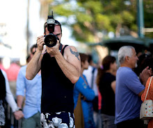
You can't just go to a studio and not take photos. Unfortunately I didn't bring a camera so I used a 30D with a nifty. Nice little combo and another proof that one doesn't have to spend tons of hard earned cash to afford the latest gear. It's all in your head and hands.
Here's a short step by of getting some good results.
First you have to find a model :)

here's our beautiful man! :)
The pic sucks major butt though. The light is flat and the face is grim.
We had some mirrors in the back and some cool light bulbs on the BG, so the task was to make all this to work together.

So I had to meter the lights first to set the correct shutter speed. The f stop was f4.5 just enough to blur the BG. What happened here though is that the lights were so bright that the slow shutter speed blew everything out miserably. This doesn't work either for us (duh) :)

The lights had to be underexposed by a stop and a half, just enough to show their warm glow. I asked Kevin to move further from the background just so the blur effect becomes more prominent. We also put a medium grid on the Alien Bee (wooohoo!) , having it a at 1/4 power. I like having my main lights high up to get this great Rembrant light. There's one problem here though. The composition is not really working out, since I cropped off the lights and the whole thing is at at an angle which is taking away from the symmetrical look I was after. Also, Kevin's face is merging with the dark background so we obviously need a second light source.

so we are pretty dark close to the end result. A nice rim at quarter power is gridded and set to the camera right, just behind the model. The horizontal orientation is working out nicely here and all we have to do is to add some color correction to get rid of the Alien Bee pink skin tint, add just a little bit of high pass filter to bring out the details in the face (I set it at 1.0px) and to add +5 on the contrast bar to make th epic pop a little. I also asked Kevin to produce the best smile he had available at 11pm after a long day...
Also I set our white balance to 4200K to make that white wall slightly blue. Since the Alien bees make any pic slightly warmer than they ought to be, we used this to our advantage. I also added a very slight color gradient effect from NIK plugins (orange and blue) to enhance the effect.

there you have it! if not a masterpiece, but certainly a rather fun little portrait of Kevin!
post your questions if you have any :)


No comments:
Post a Comment